[insert page='brand-header' display='content']

Logo
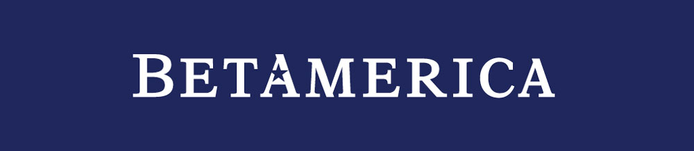
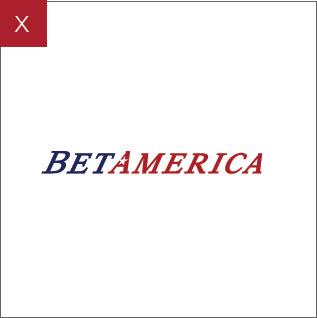
Wordmark
The BetAmerica visual identity is an expression of the high standards and qualities our company represents. This purpose built logotype consists of 10 specifically drawn letterforms and a nested star symbol. The specific tones and shades of color are used to deliver an authentic feel to the brand while creating a connection to American heritage. The BetAmerica logotype is best represented when clear space is adhered to, maintaining the brand's integrity across various media. The relationship between the letterforms should never be altered or modified in any way. Follow these guidelines in order to maintain a happy, healthy brand.Please remember
- The BetAmerica logotype must be reproduced from original artwork.
- The BetAmerica logotype may not be altered or changed in any way.
- The logotype may not be incorporated into or combined with any other mark, symbol or graphic to create a new mark.
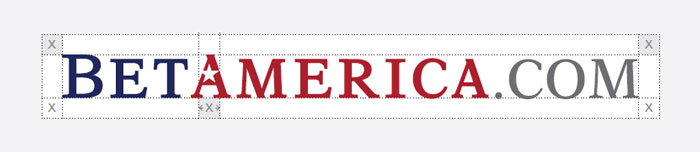
Clear Space
No Graphic Element of any sort should enter or be within the clear space, as defined and measured by the x-height surrounding the BetAmerica logotype. The x-height is defined by height of the “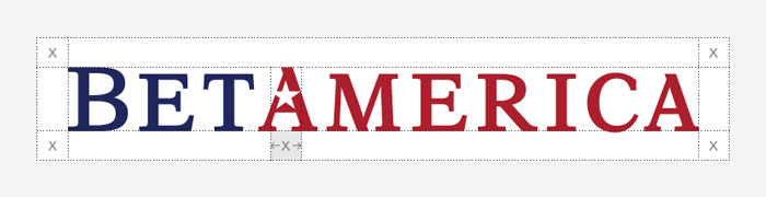
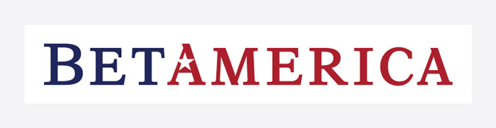
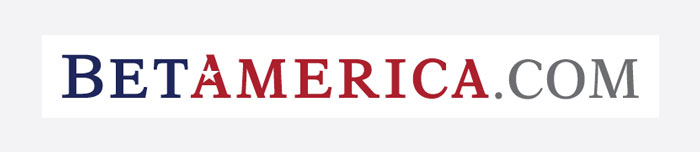
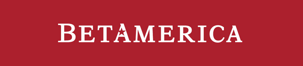
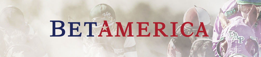
Acceptable Usage
To ensure our brand maintains its integrity and continues to communicate clearly with our customers we have provided the following examples of optimal logotype usage.
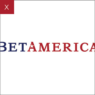
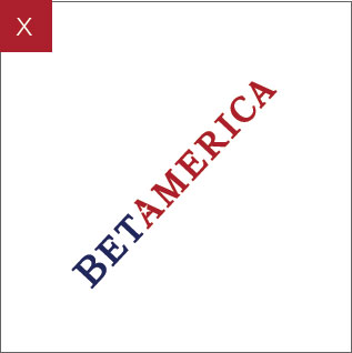
Unacceptable Usage
To ensure our brand maintains its integrity and continues to communicate clearly with our customers we have provided this short list of “Do Nots” when using the BetAmerica brand.- Do not clip
- Do not animate, rotate or render in 3D
- Do not skew or distort
- Do not combine with complicated backgrounds
- Do not recolor the logo
- Do not apply drop shadows, glows, bevels or other effects
 1
1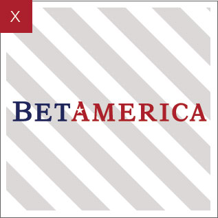 4
4
 2
2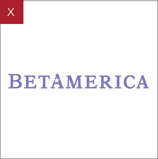 5
5
 3
3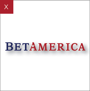 6
6